KDP Coloring Book Sample Images for Amazon Listings
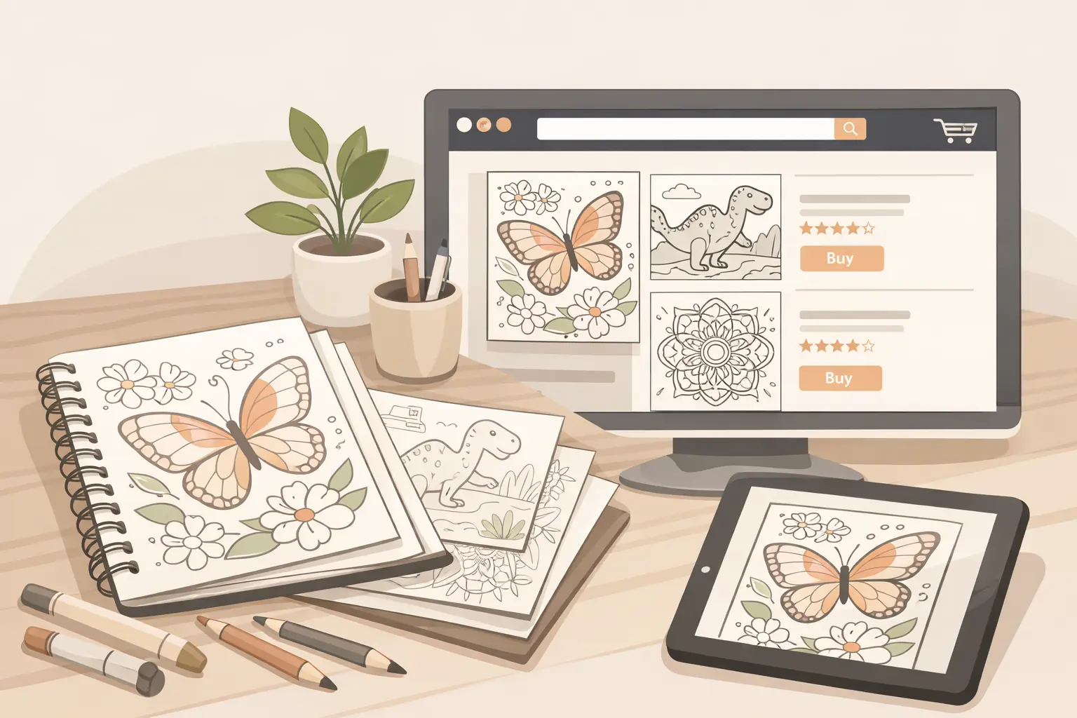
Once the full interior is finished, your KDP coloring book sample images should prove the book's promise quickly. Choose pages that show the real difficulty level, line quality, variety, audience fit, and page experience instead of relying only on a pretty cover or a vague lifestyle mockup.
Sample images are not decoration. For coloring books, they often answer the buyer's most practical questions: Is this too hard? Is it too simple? Are the pages actually varied? Does the style match the cover? Is this appropriate for the age group or mood the listing promises?
The best sample image set is honest, specific, and representative. It should make the finished interior easier to trust before the shopper buys.
Start with the listing promise

Before choosing images, write the one-sentence promise for the book.
Examples:
- A bold and easy flower coloring book for seniors who want calm, large-print pages.
- A cute dinosaur coloring book for ages 4-8 with friendly characters and simple backgrounds.
- A cozy cafe coloring book for adults who want relaxing pages with moderate detail.
- A gothic mandala coloring book for patient adult colorists who enjoy dense patterns.
That promise controls the sample image set. If the promise says bold and easy, the sample images should not mostly show the most detailed pages. If the promise says ages 4-8, the images should not hide small details that make the pages harder for younger children.
The goal is not to show every page. The goal is to help a buyer understand the normal experience of the book.
Pick a normal page before a standout page
Many creators start with the most impressive page in the interior. That can work, but it can also create expectation mismatch if the standout page is not representative.
Start by choosing one normal page that clearly shows the average book experience. It should match the promised audience, difficulty, style, and spacing.
Ask:
- Would this page feel normal inside the book?
- Does it show the actual line weight?
- Does it match the difficulty described in the listing?
- Would the target buyer understand the theme from this page alone?
- Would a negative review feel less likely because this image sets the right expectation?
For a KDP coloring book, trust often matters more than surprise. A representative page can make the listing feel more honest than a polished mockup that hides the details.
Show difficulty in a close-up
Buyers need to judge difficulty quickly. A full-page image can show composition, but it may be too small to inspect line quality, tiny gaps, crowded areas, or background detail.
Use at least one close-up image to show:
- line thickness
- amount of white space
- small detail density
- background complexity
- border and margin style
- whether the page feels beginner-friendly, moderate, or intricate
This is especially useful for books aimed at seniors, young children, beginners, or detailed adult coloring fans. Each group has different expectations. A close-up helps the listing say, visually, "this is the kind of coloring experience you are buying."
Avoid cropping only the cleanest corner of the page. The close-up should show a truthful section of the artwork, not a section that makes the book look simpler or more detailed than it really is.
Build a variety grid
A variety grid can show several pages at once. It helps buyers see that the book has enough range inside the theme.
For example:
- four flower pages with different compositions
- six dinosaur pages with different characters and scenes
- nine cozy interior pages with different objects, rooms, and angles
- four mandala pages showing the difficulty range
The grid should still be readable. If the pages are too small to inspect, use fewer images or crop each page slightly. The grid is not a page-count proof stunt. It is a variety proof.
A useful grid answers:
- Are pages too repetitive?
- Does the theme have enough depth?
- Does the style stay consistent?
- Does the book include both simple and slightly richer pages if promised?
- Are the examples clearly from the same book?
Do not include pages from a different product, a previous version, or an unfinished concept. The sample images should represent the exact book being sold.
Include one page that proves the cover
The cover makes a promise. The sample images should support it.
If the cover emphasizes cute animals, include an interior page with the same cute direction. If the cover promises bold floral designs, show a bold floral page with large coloring areas. If the cover suggests cozy cafe scenes, show an actual cafe-style interior page rather than a generic mug or pattern.
This matters because covers can be more polished than interiors. A shopper may click because the cover looks strong, then hesitate if the sample images feel unrelated. The closer the sample images are to the cover promise, the easier the listing is to trust.
Use a simple check:
- Put the cover image beside the sample images.
- Hide the title and description.
- Ask whether the sample pages still feel like the same product.
If they do not, either the sample image set is wrong or the cover promise is too far from the interior.
Avoid misleading mockups
Mockups can help, but they should not replace clear page proof.
A book-in-hand mockup, desk scene, or tablet-style preview may make the product feel more tangible. But if every image is angled, tiny, shadowed, or covered by props, the buyer cannot judge the interior.
For KDP coloring books, use mockups as support, not as the whole sample image strategy.
A stronger sequence is:
- cover image
- normal full-page interior sample
- close-up difficulty proof
- variety grid
- one theme-specific standout page
- optional A+ Content module showing who the book is for
That sequence gives both emotional and practical proof. It shows the book as a product, but it also lets the buyer inspect the actual pages.
Match sample images to the target buyer
Different coloring book buyers need different proof.
For kids' books, show age fit, friendly subjects, simple shapes, and enough whitespace. Avoid sample images that look too advanced for the stated age range.
For seniors or bold and easy books, show large areas, clear outlines, and uncluttered compositions. A close-up is important because line weight and tiny details can affect usability.
For adult relaxation books, show mood, detail level, and variety. Buyers may want pages that feel calm without becoming repetitive.
For intricate adult books, show enough detail to attract the right buyer, but do not hide how dense the pages are. The right audience will appreciate clarity. The wrong audience should be able to self-select out before buying.
Good sample images reduce mismatched expectations. That can matter for conversion, reviews, and future catalog decisions, even though no image set can guarantee sales or rankings.
Use A+ Content as proof modules
If you use A+ Content, think in modules rather than decoration.
Useful modules for a KDP coloring book include:
- difficulty level proof
- page variety preview
- audience fit statement
- single-sided page explanation if true
- theme examples
- line-quality close-up
- series or related-book positioning
Each module should make one useful point. Avoid repeating the same beautiful page in different layouts. A+ Content is most helpful when it answers objections the basic listing cannot answer quickly.
For example, a bold and easy flower book might use one module for large-print line art, one for page variety, and one for calm beginner-friendly themes. A kids' dinosaur book might use friendly character samples, simple backgrounds, and age-fit examples.
Keep file quality practical
Sample images need to look clean on Amazon, but they should still be based on the final interior.
Check:
- images are sharp enough to inspect
- text inside images is readable
- page edges are not accidentally cropped
- white backgrounds do not disappear into the page
- close-ups are not blurry
- the images match the final exported interior
- no outdated draft pages remain in the image set
If you change the interior after preparing sample images, review the image set again. A small production change can make an old sample image inaccurate.
Use ColoringBook.dev for sample-image candidates
ColoringBook.dev fits this stage when creators need the sample image workflow to stay tied to the finished book.
Use the same creative direction that produced the interior. Select representative full pages, close-ups, and variety examples from the finished set. Keep the sample image candidates connected to the same style rules, audience, and difficulty level used during production.
This is product-adjacent without overpromising. ColoringBook.dev can help creators prepare consistent, print-ready page assets and visual proof candidates. The creator still decides which images are honest enough for the listing, which pages belong in A+ Content, and whether the final presentation matches KDP's current requirements.
Final sample image checklist
Before publishing or refreshing the listing, check the image set:
- The first interior sample represents the normal book experience.
- At least one close-up shows real line quality and difficulty.
- A variety grid proves the book is not repetitive.
- The images support the cover promise.
- The target audience can judge fit quickly.
- Mockups do not hide the actual pages.
- A+ Content modules answer practical buyer questions.
- Every image comes from the final interior.
- The image set does not exaggerate simplicity, detail, or page variety.
- The listing copy and sample images tell the same story.
KDP coloring book sample images are a trust layer. They do not need to be loud. They need to be clear.
When the images show real pages, honest difficulty, and enough variety, the listing becomes easier for the right buyer to understand. That is the point of this stage: turn the finished interior into visual proof before asking someone to buy it.
Free tools for this workflow
Use the relevant CBE utility before export: free Cover Grid Designer and free Coloring Page Printability Checker. Each tool runs as a focused browser utility, and file-based checks stay local where the tool says so.