KDP Coloring Book Cover Design: Make the Promise Match the Interior
A coloring book cover has one job before anything else: it must help the right buyer understand what kind of book they are looking at.
That sounds simple, but many KDP coloring book covers fail because they try to do too much. They use a busy collage, vague title, generic subtitle, or art style that does not match the interior. The result is a book that may look decorative, but does not clearly explain the page experience.
For KDP creators, cover design is not only a graphic design task. It is a positioning task. The cover should connect the niche, buyer, difficulty level, mood, and interior style in a few seconds.
This guide focuses on a practical cover workflow for coloring book makers. It is not about chasing a perfect design formula or copying competitors. It is about making the cover promise specific enough that buyers know what they are getting, and honest enough that the interior can deliver.
Start with the buyer promise

Before opening Canva, Photoshop, Affinity, or any cover template, write the buyer promise in one sentence.
Examples:
- A bold and easy animal coloring book for young kids.
- A cozy adult coloring book with calm indoor scenes and moderate detail.
- A simple large-print floral coloring book for seniors and beginners.
- A cute spooky coloring book for adults who want playful Halloween pages.
- A vehicle coloring book for kids who like trucks, diggers, and construction themes.
This sentence should guide every cover decision. If the cover looks more advanced than the pages, the buyer may feel misled. If the cover looks too childish for an adult book, the right audience may scroll past it.
The goal is not to make the most artistic cover possible. The goal is to make the most accurate and clickable promise for the book you actually made.
Match the cover style to the interior style
The cover and interior do not need to be identical, but they should feel like they belong to the same product.
If the interior uses bold simple lines, a cover packed with tiny details can set the wrong expectation. If the interior is detailed and ornate, a very plain cover may undersell the book. If the interior is cute and rounded, a realistic cover illustration can confuse the tone.
Check for alignment across four areas:
- line style
- subject matter
- difficulty level
- mood
For example, a "bold and easy" kids book should usually show clear shapes, friendly characters, and simple compositions. A cozy adult book can use richer scene detail, warmer props, and a calmer layout. A mandala book should make pattern density obvious so buyers can judge whether the pages are easy, intermediate, or intricate.
The cover is a preview of the page experience. Treat it that way.
Make the title specific enough
Generic coloring book titles are easy to write and hard to sell.
"Cute Coloring Book" does not say much. "Cute Woodland Animals Coloring Book for Kids" gives the buyer more to work with. "Cozy Cafe Coloring Book for Adults" sets a clearer scene than "Relaxing Coloring Book."
A useful title usually includes at least two of these:
- subject: animals, flowers, trucks, cafes, dragons
- audience: kids, adults, seniors, beginners
- style: bold and easy, cozy, cute, simple, detailed
- use case: relaxation, large print, activity book, stress relief
- season or occasion: Halloween, Christmas, summer, birthday
Do not stuff every phrase into the title. A title still needs to be readable on a thumbnail. But if the title could describe hundreds of unrelated books, it is probably too broad.
Use the subtitle to reduce doubt
The subtitle is where you clarify the promise without overloading the main title.
Useful subtitle details include:
- number of pages or designs
- age range or skill level
- style cues
- page format
- buyer benefit
- theme scope
Examples:
- 50 Bold and Easy Animal Pages for Ages 4-8
- Relaxing Cozy Cafe Scenes with Simple Lines and Low-Stress Detail
- Large Print Floral Designs for Adults, Seniors, and Beginners
- Cute Spooky Characters, Pumpkins, Ghosts, and Fall Scenes
Avoid vague filler like "fun for everyone" or "perfect gift for all ages." Those phrases sound broad, but they often make the positioning weaker. A good subtitle helps the buyer decide whether the book is for them.
Design for thumbnail first
Most buyers will first see the cover as a small image in search results or recommendation rows. That means the cover has to work before anyone zooms in.
A thumbnail-friendly cover usually has:
- one clear focal point
- strong contrast between title and background
- large readable title text
- limited font styles
- enough whitespace around the main elements
- a subject that communicates quickly
Busy interiors can still make good books, but busy covers often collapse at thumbnail size. If the title is hard to read at a small size, simplify. If the subject is unclear, choose one stronger visual instead of many weaker ones.
A practical test is to zoom out until the cover is about the size of an Amazon search thumbnail. If you cannot read the main phrase or identify the theme, the design needs work.
Choose a cover template after the concept is clear
KDP cover templates are useful, but they do not solve positioning. A template helps with dimensions, spine, bleed, and layout zones. It does not decide what the book should promise.
Before choosing a template, confirm:
- trim size
- page count
- paper type
- bleed choice
- whether the book needs a spine
- whether your design should wrap to the back cover
KDP's own cover calculator or template download should be the source for final dimensions. Third-party templates can help with workflow, but the final file still needs to match the exact KDP setup for your book.
For many coloring books, the front cover is the most important selling surface. The back cover should support the promise with a short description, sample-page preview, or clear feature bullets. It should not introduce a different audience or theme.
Keep the back cover practical
The back cover does not need to repeat the entire listing. It should make the book feel complete and trustworthy.
Useful back cover elements:
- short description of the book
- three to five feature bullets
- sample interior previews
- audience or age range
- note about single-sided pages if true
- simple brand or series mark if relevant
Be careful with claims. Do not promise medical, therapeutic, educational, or developmental outcomes unless you can support them and they are appropriate. "Relaxing pages for a quiet coloring session" is safer and clearer than inflated claims about stress, anxiety, or guaranteed benefits.
For kids books, avoid trying to appeal to every parent at once. Make the use case clear: preschool coloring, simple animals, rainy-day activity, vehicle pages, holiday activity, or another specific context.
Check that the interior can deliver the cover promise
Before exporting the final cover, compare it against the actual interior.
Ask:
- Does the cover show the same subject matter as the pages?
- Does the difficulty level match the interior?
- Does the title describe the real buyer?
- Does the subtitle avoid overpromising?
- Would a buyer be surprised after opening the book?
- Are the best interior pages strong enough to support the cover?
This step matters because a strong cover can temporarily lift interest, but a mismatch can hurt reviews, returns, and trust. The best cover is not the one that makes the book look like something else. It is the one that sells the right version of the book to the right buyer.
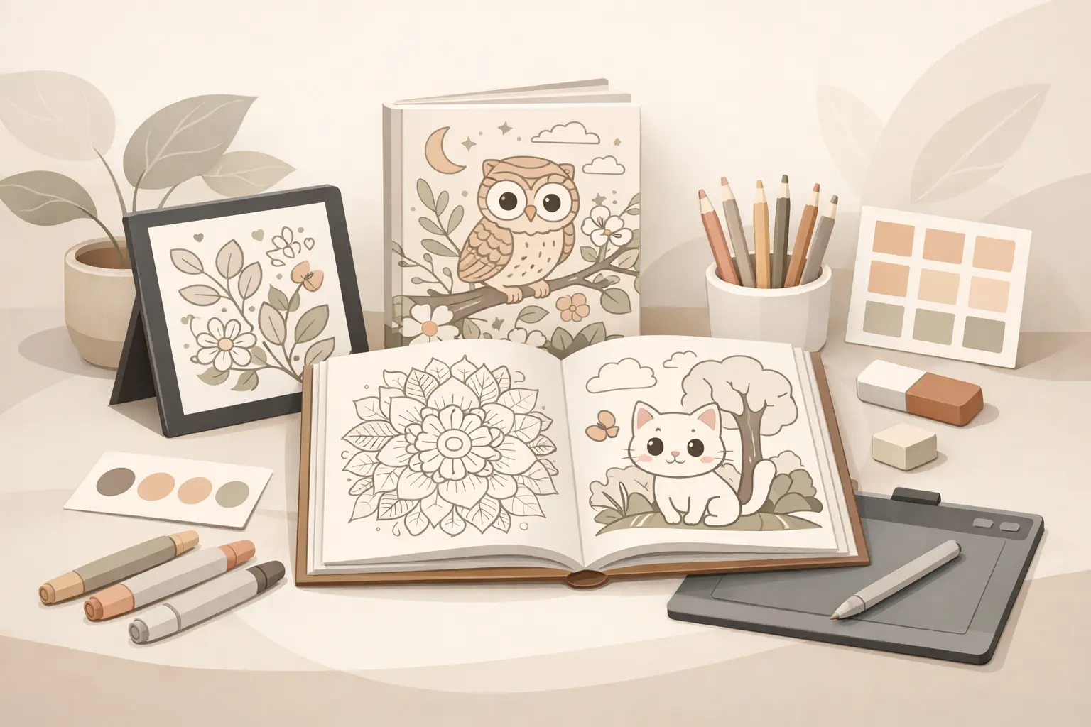
Use sample pages before committing to the cover
If you are still early in production, make a small sample set before designing the final cover.
Five to eight representative pages can tell you:
- whether the style is actually consistent
- whether the niche has enough visual range
- whether the book feels easy, moderate, or detailed
- which image should influence the cover
- whether the buyer promise needs to be adjusted
This is where ColoringBook.dev can fit naturally into the workflow. Use it to test page directions, compare visual styles, and create sample interiors before you commit to a final cover promise. The tool should help you make a better decision faster, not push you to publish a full book before the concept is clear.
For example, if three sample directions produce very different page complexity, do not design the cover yet. Decide which buyer you are serving first.
Build covers as part of a series system
If you plan to publish more than one book in a niche, treat cover design as a system.
Series consistency can include:
- similar title structure
- consistent typography
- recurring brand mark
- shared layout grid
- related color palette
- clear subject variation
But each book still needs its own reason to exist. A series cover system should make books feel connected, not interchangeable.
For example, a cozy adult series might use the same title placement and typography across "Cozy Cafes," "Tiny Libraries," and "Cottage Kitchens." The subject art, color mood, and subtitle should change enough that each book feels distinct.
This is especially useful if you are building a repeatable KDP workflow. A cover system saves time while preserving buyer clarity.
Common cover mistakes to avoid
Avoid these patterns:
- title text that is unreadable at thumbnail size
- cover art that is much more polished than the interior
- vague titles that do not name the buyer or theme
- too many fonts, badges, and decorative elements
- subtitles that promise too many audiences
- covers copied too closely from competitors
- back covers filled with generic filler
- final dimensions based on the wrong trim size or page count
Most of these mistakes happen when the creator designs the cover separately from the product strategy. Keep the cover tied to the actual book and the decisions become easier.
A simple KDP coloring book cover workflow
Use this order:
- Define the buyer promise in one sentence.
- Confirm the interior style, audience, and difficulty level.
- Write a specific title and clarifying subtitle.
- Choose one strong cover visual direction.
- Test readability at thumbnail size.
- Confirm trim size, page count, bleed, and template dimensions.
- Design the front, spine if needed, and back cover.
- Compare the final cover against sample interior pages.
- Export and proof the file before publishing.
This workflow keeps the cover connected to the book instead of treating it as decoration.
Final takeaway
Good KDP coloring book cover design is not about making the loudest cover. It is about making the clearest promise.
The cover should tell buyers what the book is, who it is for, how difficult the pages are, and what kind of coloring experience they can expect. If the cover and interior agree, the listing feels more trustworthy. If they do not, even a beautiful cover can create the wrong expectation.
For creators, the practical move is to design the cover after the buyer promise and sample pages are clear. That gives you a stronger title, a more honest subtitle, a better visual direction, and fewer surprises when the book reaches KDP.