KDP Coloring Book A+ Content and Sample Image Strategy: Show the Interior Promise Before Buyers Click Away
A KDP coloring book listing does not end with the title, subtitle, description, and backend keywords. Those fields help shoppers understand the book in words. But coloring books are visual products, so many buyers still need to answer one more question before they feel confident:
What do the actual pages look like?
That is where sample images, Look Inside previews, and A+ Content can help. They do not replace a strong cover or clear listing copy. They support it by showing the interior promise in a way text cannot.
For KDP coloring book creators, this matters because disappointment often comes from a mismatch between expectation and interior. A shopper might expect bold and easy pages, then find intricate details. Another shopper might expect adult-level complexity, then find very simple outlines. A parent might expect kid-friendly designs, then find pages that are too advanced for the stated age range.
The goal of a sample image strategy is not to make the book look bigger than it is. The goal is to help the right buyer quickly see whether the book fits.
Start with the listing promise

Before choosing sample images, write down the promise your listing already makes.
Examples:
- Bold and easy animal coloring pages for adults and beginners
- Cute dinosaur coloring pages for kids ages 4-8
- Large-print flower designs for seniors and relaxed coloring
- Cozy cafe scenes with simple details for calm coloring time
- Spooky but friendly Halloween pages for young kids
This promise should come from the actual interior, not from a keyword opportunity alone. If the book is described as bold and easy, the samples should clearly show bold and easy pages. If the book says "50 cute animal designs," the samples should show the range of animals included, not only the strongest two pages.
Think of the listing promise as a filter. Any image that does not support it should be replaced.
Choose representative pages, not only the prettiest pages
It is tempting to show only the most impressive pages. That can work for art books, but coloring book buyers usually need a more practical preview.
A useful sample set should answer these questions:
- How detailed are the pages?
- Are the outlines bold, thin, simple, or intricate?
- Does the theme stay consistent?
- Are the pages single-scene illustrations, patterns, activity pages, or mixed formats?
- Does the age range or skill level feel accurate?
- Are there enough visible examples to trust the book's direction?
Pick pages that represent the full interior experience. Include strong pages, but also include normal pages that show the true average quality and style. If every preview image is an outlier, the buyer may feel misled later.
For a 50-page book, a practical sample set might include 6-10 interior examples: a few best pages, a few typical pages, and one or two pages that show variety within the niche.
Show page complexity clearly
Complexity is one of the biggest buyer decision points for coloring books.
For adult coloring books, shoppers may want to know whether the book is relaxing and simple, detailed and immersive, or somewhere in between. For kids books, parents may want to see whether the designs match the stated age range. For seniors or beginners, large shapes and clear lines may matter more than visual density.
Your sample images should make complexity obvious. Avoid preview mockups where the page is too small to inspect. A beautiful lifestyle mockup can support the listing, but at least some images should show the page itself close enough for buyers to judge line weight, spacing, and detail.
If the book has a deliberate style, name and show it:
- bold and easy
- large print
- simple outlines
- detailed patterns
- cute characters
- cozy scenes
- mandala-style designs
- activity pages with coloring elements
Do not make buyers guess what those words mean in your book.
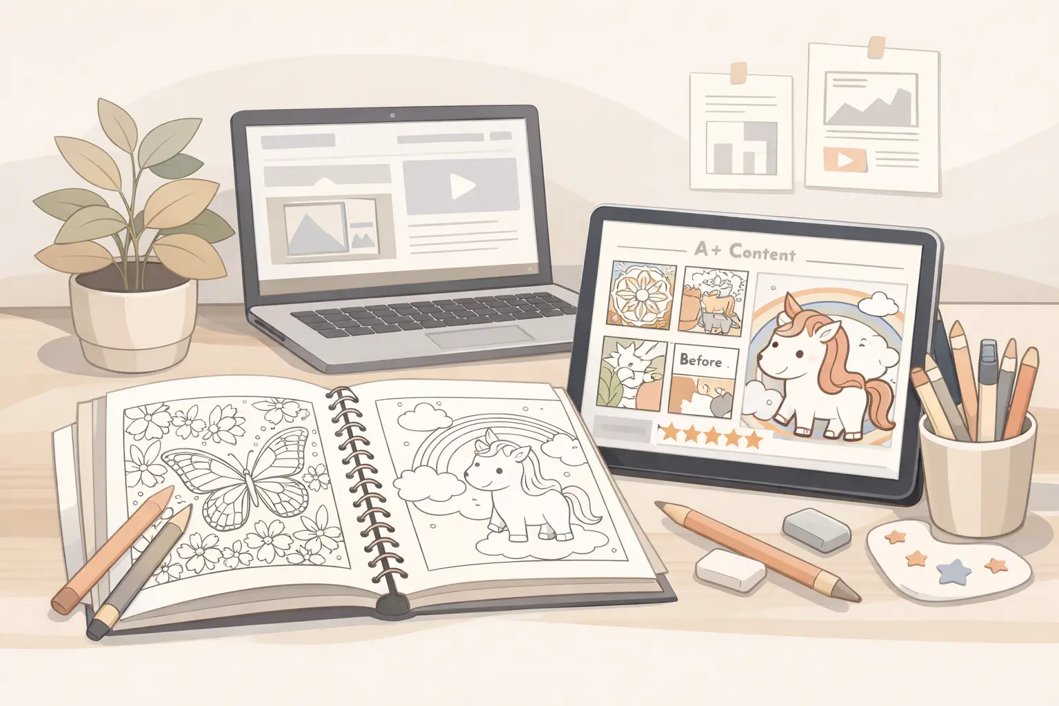
Use A+ Content as a visual explanation, not a second sales letter
If you have access to A+ Content through Amazon's brand tools, treat it as a visual extension of the product page. For coloring books, A+ modules are most useful when they make the book easier to understand.
Good A+ Content can show:
- a clear interior sample grid
- a "what's inside" section
- page style examples
- audience and difficulty cues
- theme variety inside the book
- format details such as single-sided pages if true
- a series comparison if you have multiple related books
Weak A+ Content usually repeats vague claims:
- beautiful designs
- perfect gift
- hours of fun
- premium quality
- great for everyone
Those phrases do not reduce uncertainty. A buyer has already seen many listings say the same thing. Use A+ space to show details that make this specific book easier to evaluate.
Build a simple sample image sequence
A strong image sequence does not need to be complicated. It needs to answer buyer questions in a sensible order.
Try this structure:
- Cover image: the main visual promise.
- Interior grid: 6-9 representative page thumbnails.
- Close-up sample: one page shown large enough to inspect line detail.
- Style explainer: a simple image that labels the page style, such as bold outlines or easy shapes.
- Variety image: a spread that shows different subjects inside the same niche.
- Format image: trim size, single-sided pages, or page count if those details are accurate.
- Series image: optional, only if the book belongs to a real series.
This sequence helps the buyer move from first impression to practical confidence. It also keeps the listing focused on what the shopper can actually verify.
Match preview images to the cover
The cover and interior samples should feel like the same book.
If the cover uses a cute, playful animal style, the sample pages should not shift into realistic wildlife illustrations. If the cover promises cozy adult coloring, the samples should not feel like generic clipart. If the cover is bold and simple, the interior should not suddenly become dense and intricate.
This is especially important when creators use AI-assisted workflows. It is easy to generate attractive images in several related styles, then accidentally combine pages that do not belong together. A listing can look polished on the surface while the interior feels inconsistent.
Before publishing, put the cover and sample pages side by side. Ask whether a buyer would feel the interior naturally follows the cover promise. If not, fix the interior or adjust the listing before sending traffic to the page.
Use sample pages before finalizing A+ images
Do not wait until the final upload to discover that the pages do not support the listing. Build sample pages early in the production workflow.
A practical sequence:
- Choose the niche and audience.
- Generate or design 10-15 sample pages.
- Sort them by quality, style consistency, and difficulty.
- Write the listing promise from the best consistent direction.
- Build the full interior around that direction.
- Select representative sample images from the final interior.
- Create A+ modules or product images that match the finished book.
ColoringBook.dev fits naturally in this planning stage. You can test visual directions, compare page complexity, and create representative samples before locking the cover, title, description, and keyword promise. The value is not only faster page generation. It is being able to see whether the book idea is visually coherent before you publish it.
Avoid misleading mockups
Mockups can make a listing feel more professional, but they should not hide the actual product.
Be careful with:
- pages shown too small to inspect
- heavy shadows or angles that obscure line detail
- colored-in pages that make a blank coloring page look more finished than it is
- lifestyle scenes that do not show the interior clearly
- sample spreads that imply more variety than the book contains
- claims about paper quality or printing that KDP production may not support
For KDP paperback coloring books, remember that the final product is printed through Amazon's production process. Do not imply premium materials, special binding, perforated pages, or paper features unless they are actually part of the format.
Clear and honest images usually work better than overly polished images that create the wrong expectation.
Use captions and image text carefully
Some creators add text overlays to product images or A+ modules. This can help if the text is specific and readable.
Useful labels:
- 50 bold and easy designs
- Single-sided pages if true
- Large 8.5 x 11 inch format if true
- Cute animal scenes for adults and beginners
- Simple shapes for ages 4-8
- Includes flowers, gardens, butterflies, and cozy nature details
Less useful labels:
- amazing quality
- perfect for everyone
- best coloring book
- guaranteed relaxation
- unlimited fun
Keep image text short. The image should do most of the work. Text should clarify what the buyer is seeing, not make inflated claims.
Check the full buyer path
Before publishing or updating the listing, review the buyer path in order:
- Search result: Does the cover and title attract the right buyer?
- Product page: Does the subtitle and description explain the promise clearly?
- Images: Do the samples prove the promise visually?
- Preview: Does Look Inside or sample content support the same expectation?
- Purchase: Would the printed interior feel consistent with what was shown?
If any step changes the promise, the listing needs more work. A+ Content should not promise one thing while the description says another. Sample images should not show a different style from the cover. Keywords should not attract an audience the pages do not serve.
The best KDP coloring book listings are usually not the loudest. They are the clearest. They help the right buyer understand the book quickly, and they let the wrong buyer move on before a bad purchase happens.
A practical checklist
Use this checklist before finalizing sample images or A+ Content:
- The cover, title, description, and samples all point to the same audience.
- The sample pages show the real page complexity.
- The images include representative pages, not only the most impressive pages.
- The style is consistent across the cover and interior.
- Any text overlays are specific, truthful, and easy to read.
- Format claims are accurate for the final KDP paperback.
- The listing does not imply features the book does not include.
- The visual sequence answers buyer questions before repeating sales language.
For creators, this is a conversion step as much as a design step. A clearer preview can help reduce hesitation, reduce mismatch, and make the book feel more trustworthy.